

0.4 DEFENSIER
Mobile application: IOS
2022
Webpage
PROJECT OVERVIEW
BACKGROUND:
Project carried out for Ecuador over 4 months, concurrently with three other projects for the same client. Our team included a product manager, a product owner, and my role as a UX/UI designer. The client's team was made up of two stakeholders and a development manager.
The deteriorating safety situation in Guayaquil has seen a substantial rise in the recent years, evolving into a daily concern for its residents in their daily activities. This issue affects everyone, including those from affluent backgrounds and public figures.
PROBLEM:
SOLUTION:
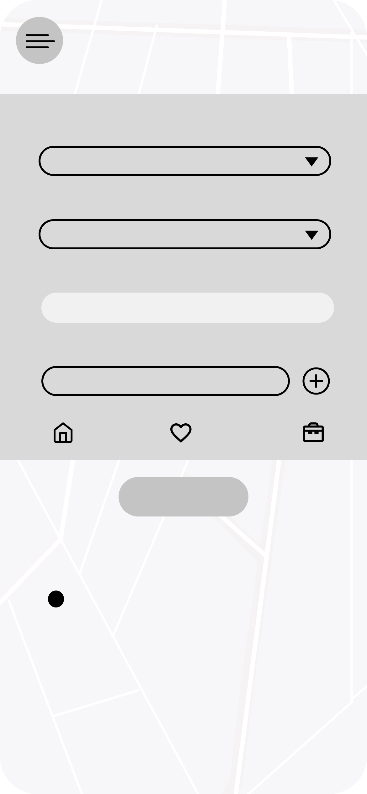
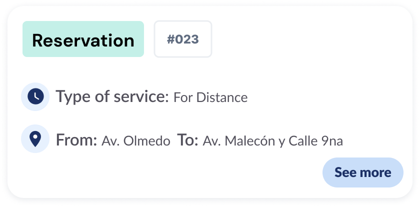
Created a mobile app to protect the residents of Guayaquil. It allows real-time or reserved secure transportation services, including motorized escorts, armored vehicles, armed escorts, and safe movement of valuables.
ABOUT THE PROCESS

01 EMPATHIZE:
I conducted UX benchmarking to deeply analyze the market and observe how other players were addressing similar products or features.
I conducted desktop research to understand the selected target audience and current design trends for this product.
I conducted user interviews using a previously formulated script to gain a deeper understanding of our users' behaviors and to obtain real data
to validate our hypotheses regarding on the security problems in Guayaquil, Ecuador.
Quantitative Data Analysis: For analysis quantitative data obtained from the interviews to identify trends and patterns.
Qualitative Discoveries: For discover insights and gathering in-depth feedback on user concerns and fears.
INTERVIEWS:
PROCESS OVERVIEW
Measuring User Needs: As an initial step, we gauged user needs and concerns.
Creating Targeted Questions: To validate our hypotheses, we formulated precise questions.
Refining Hypotheses: With the feedback and insights gathered, we refined our initial hypotheses based on real user experiences and perceptions.
Community in ECUA:
66.8% feel unsafe or have problems going out of their houses.
78.6% don't trust the services in their city and have to hire private ones.
85.5% can't access a bulletproof car at the moment.
80.5% feel worried when a family member has to move to another place alone.
100% feel unsafe when they have to move valuable items or conduct important transactions.
INSIGHTS
USER PERSONAS
I created 5 user personas to gain a deep understanding of all possible scenarios.


EMPATHY MAP
We created a map visualization of our user personas to gain a better understanding of their daily context.

02 DEFINE:
We processed the feedback and insights, which were based on real data gathered during the Empathize stage, to analyze and formulate our problem statements.
PROBLEM STATEMENTS
Guayaquil citizens need to have an accessible and safe way to move around the city because they feel unsafe when they leave their houses.
Guayaquil citizens need to have a safe way for their families to move around the city because they fear for their safety due to the insecure situation in the city.
Guayaquil citizens need a trusted way to move valuables or conduct transactions without leaving their houses or going with company because they feel unsafe due to the insecure situation in the city.
03 IDEATE:
We used the brainstorming process, utilizing the insights gathered in the previous steps, to generate as many solutions as possible based on situations and characters that inspire us. We selected the final solutions organizing them according to their ease of application and originality.
SITUATIONS

CHARACTERS

04 DESIGN:
We created diagrams and wireframes to gain clarity on the sequence and content of screens that the user will navigate through before designing them.
USER FLOW

WIREFRAMES


DESIGN SYSTEM
I created a complete new Design System that uses uses neutral colors combined with more saturated colors, along with an extensive pattern library to ensure consistency, coherence, and efficiency across the design on all the screens.
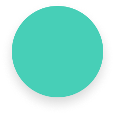
PRIMARY COLORS


#1C3166
#E2EBFF
#47CFB7
Light Blue: Calm and order.
Blue: Security and trust.
Green: Balance.
BACKGROUND AND TEXT COLORS

Black: Order.
#FFFFFF
White: Simplicity.
#000000
ICON STYLE
I designed robust rounded icons with a modern and simple style for a visual consistency.

TYPOGRAPHY
I selected the Lato typography for its versatile use with different weights and for the semi-rounded details of the letters, which impart a feeling of warmth. The strong structure provides stability and seriousness, and it is also easy to read on screens

LOGO
The logo design features a circular shape with three lines, representing the different verticals within Diginnova: Defensier, Panialert, and Building Management. The design elements are consistently used across all logos for easy visual recognition of Diginnova's products. The circle and hand symbolize protection and care provided by the products.
Typography: Poppins Semibold.

Logo:
Favicon:


Isotype:
UI COMPONENTS
APP COMPONENTS:

Disabled button

Enabled button
Two options button

Secondary buttons


Cards


Dropdown

WEB COMPONENTS:
Disabled button

Enabled button

Search bar

Card
Toggle button off

Toggle button on

Select date button

Dropdowns

05 TEST:
I crafted a first lo-fi prototype to test it using diverse testing methods to improve and validate the design with the target audience in order to then design the iterated hi-fi screens.
PROCESS OVERVIEW
HI-FI SCREENS
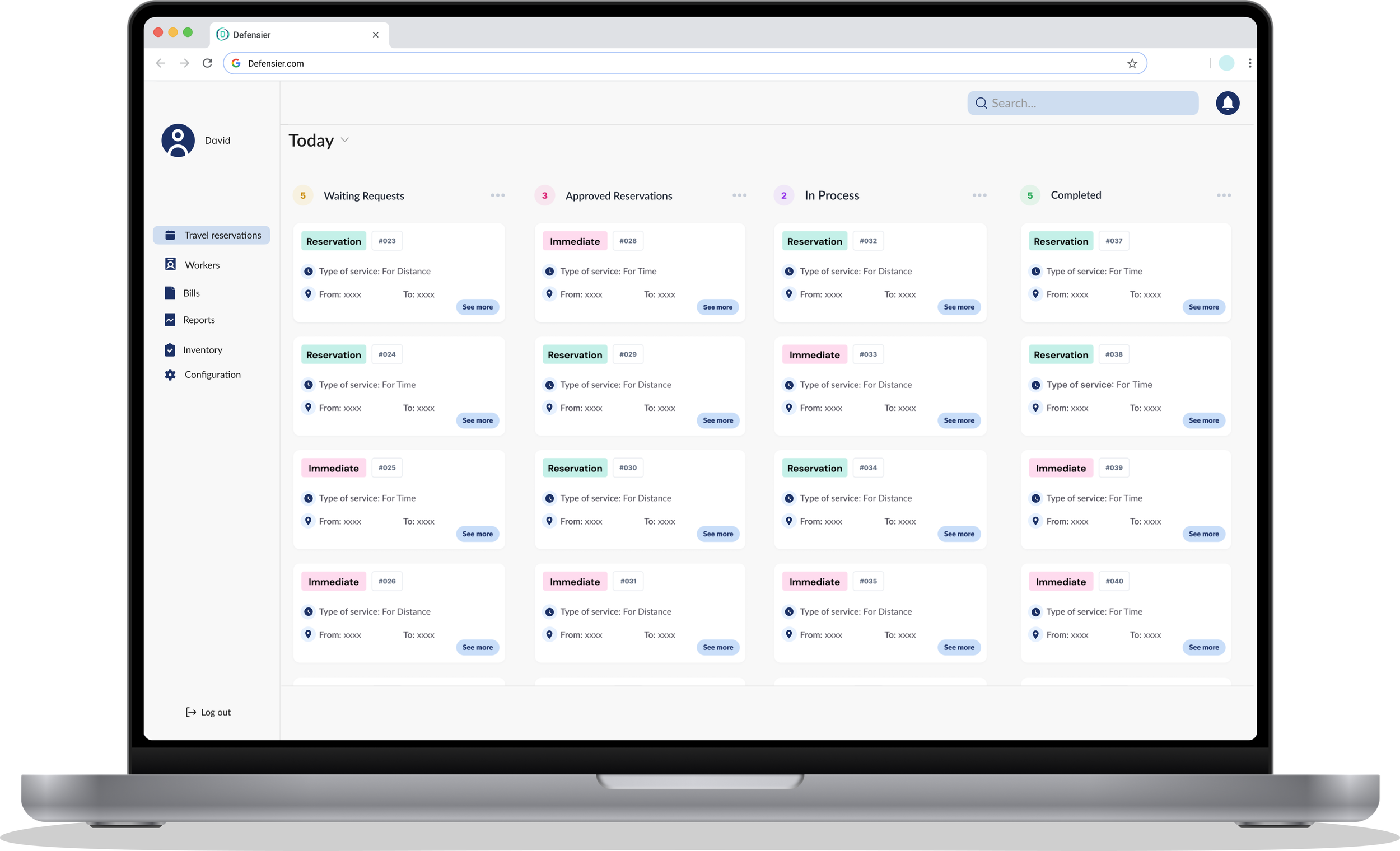

SECURITY ON DEMAND:


VALUE MOVEMENT:

OUTCOME
I designed and prototype more than +120 web and mobile screens with their different functions in 4 months.