
0.1 BRAND ALIGNMENT
2023
Webpage
PROJECT OVERVIEW
BACKGROUND:
Project carried out for United States. Timeline: two months. Our team included a product manager, a product owner, the development team, and my role as a UX/UI designer.
PROBLEM:
The platform required the release of an updated version with new features, but the design failed to visually convey this necessity, resulting in an impression of being outdated and old.
SOLUTION:
Update the UI design by implementing changes in colors, typography, and design components that collectively communicate a modern, clean, and simple aesthetic. Furthermore, implement UX changes and create new screens to accommodate the newly incorporated features.
ABOUT THE PROCESS

01 RESEARCH:
I conducted UX benchmarking to deeply analyze the market and observe how other players were addressing similar products or features.
I conducted desktop research to understand the selected target audience and current design trends for this product.
02 DESIGN:
I created a complete new Design System using the orange color to express the brand, and added saturated and neutral colors along with an extensive pattern library to ensure consistency, coherence, and efficiency across the design on all the screens.
DESIGN SYSTEM
PRIMARY COLORS


#FFE0C2
#1B59F8
#F6F6F6
BACKGROUND AND TEXT COLORS


#FF7F05
#FFFFFF
#848996
SECONDARY COLORS

#E6EDFE
#000000
EXPLANATION OF COLORS:
Orange: Optimism and confidence.
Blue: Positive and motivating.
Black: Order and elegance.
White: Simplicity.
Grey: Elegance.
ICON STYLE
I designed rounded thin line icons with a modern and simple style.


TYPOGRAPHY

I selected Nunito Sans typography for its highly-readable and versatile use with different weights. It also communicates simplicity, with characters that have thin, uniform stroke widths that work well for both body and display copy.
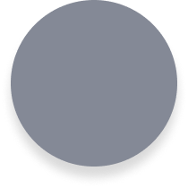
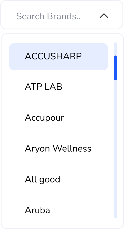
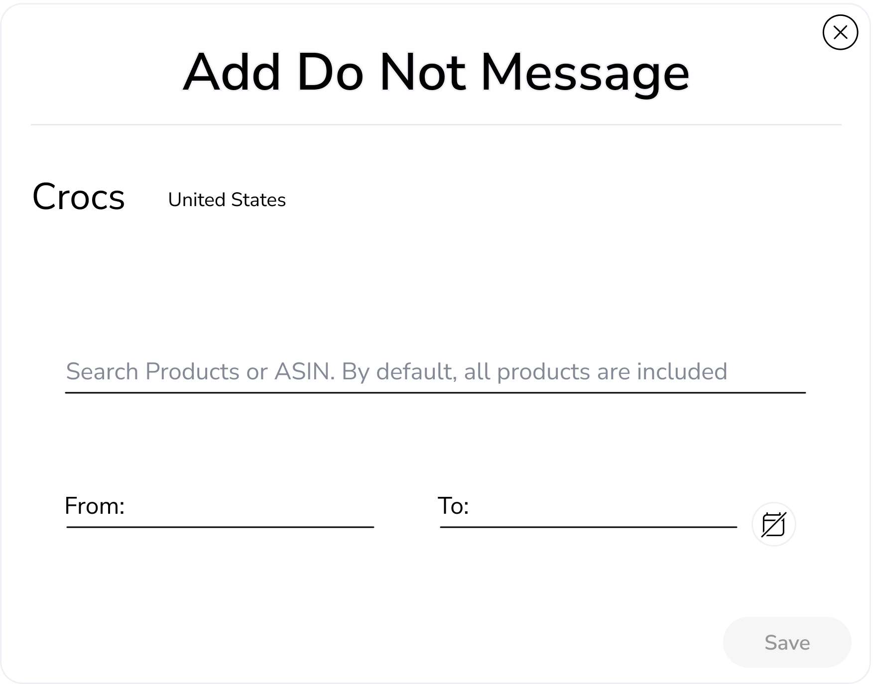
UI COMPONENTS
Enabled state

Selected state

Hover state

Drop-down close

Drop-down open
Enabled state

Disable state

Calendar

Menu bar open - close

Pop-up
Cards


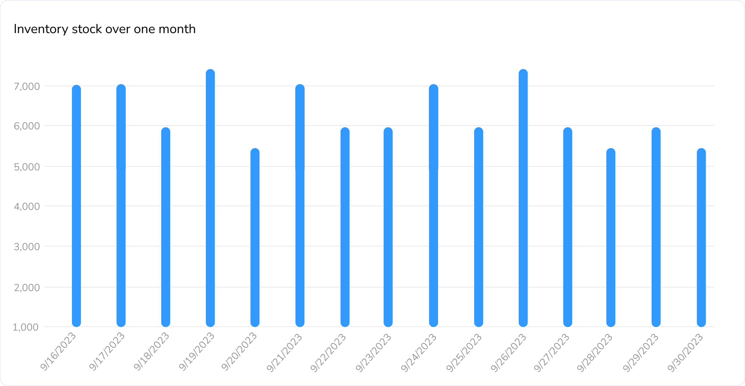
Chart
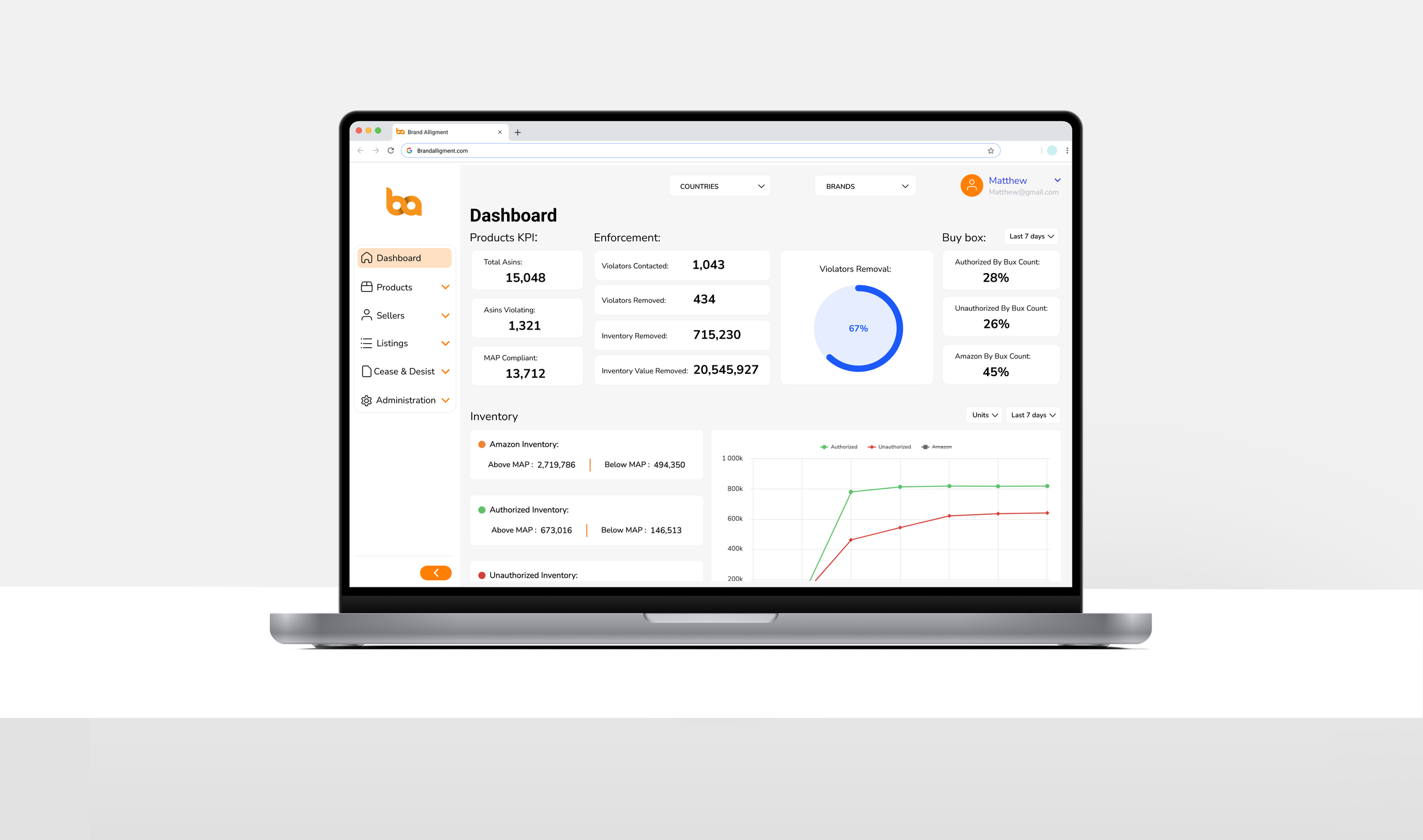
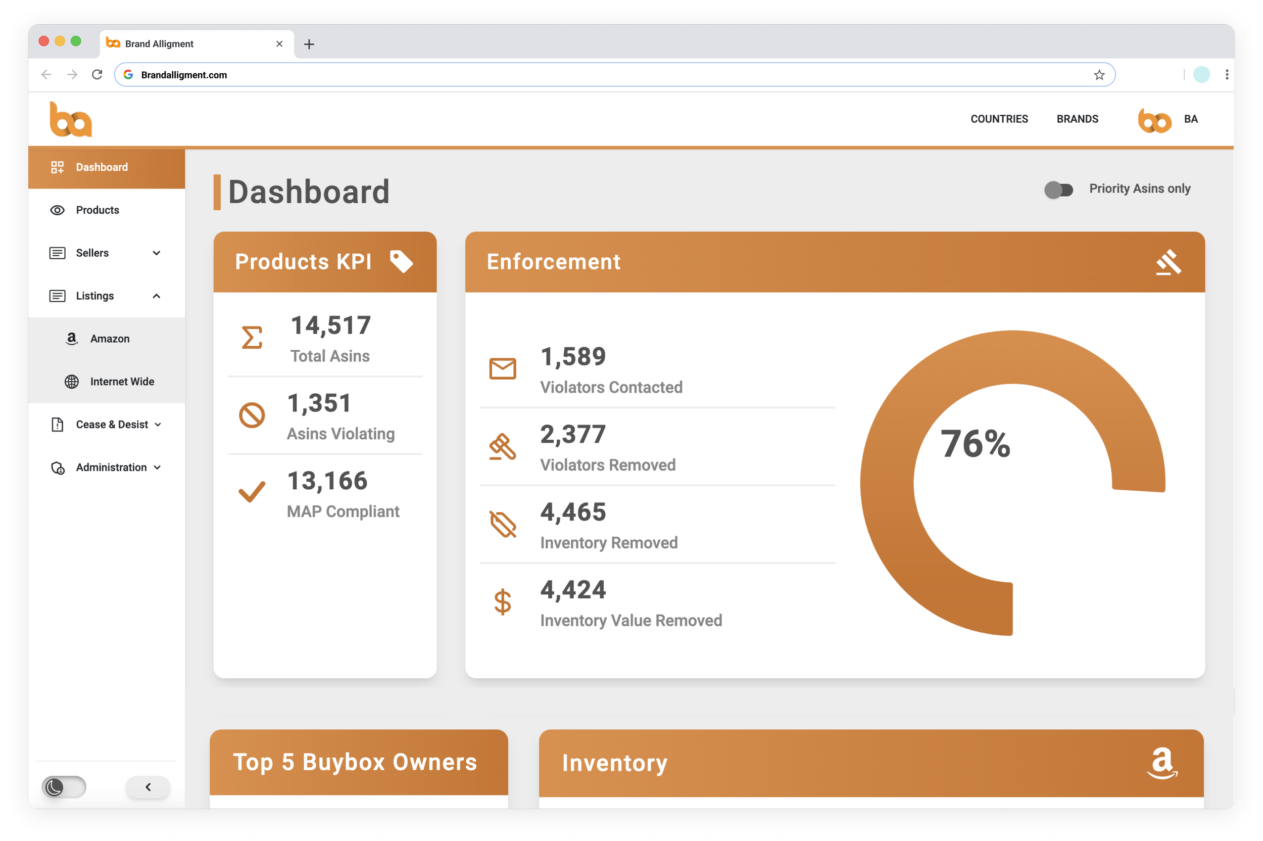
HI- FI SCREENS
I designed the incorporation of the new features and redesigned the entire website in low-fi using Figma to quickly validate the ideas. Then, based on the new design system and the approved ideas, I created the hi-fi screens.
BEFORE AND AFTER SCREENS
BEFORE:


AFTER:


OUTCOMES
Designed over 50 hi-fi web screens within two months.
Increased the conversion rate with the new UI design and UX changes.
Increased the product usability and customer satisfaction by:
Reducing user error rate.
Reducing time on tasks.