

0.3 PANIALERT
Mobile application: IOS
2022
PROJECT OVERVIEW:
BACKGROUND:
Project carried out for Ecuador over 5 months, concurrently with three other projects for the same client. Our team included a product manager, a product owner, and my role as a UX/UI designer. The client's team was made up of two stakeholders and a development manager.
PROBLEM:
The people in Quayaquil dont’t have a quick, safe, and reliable way to request immediate medical and security assistance.
SOLUTION:
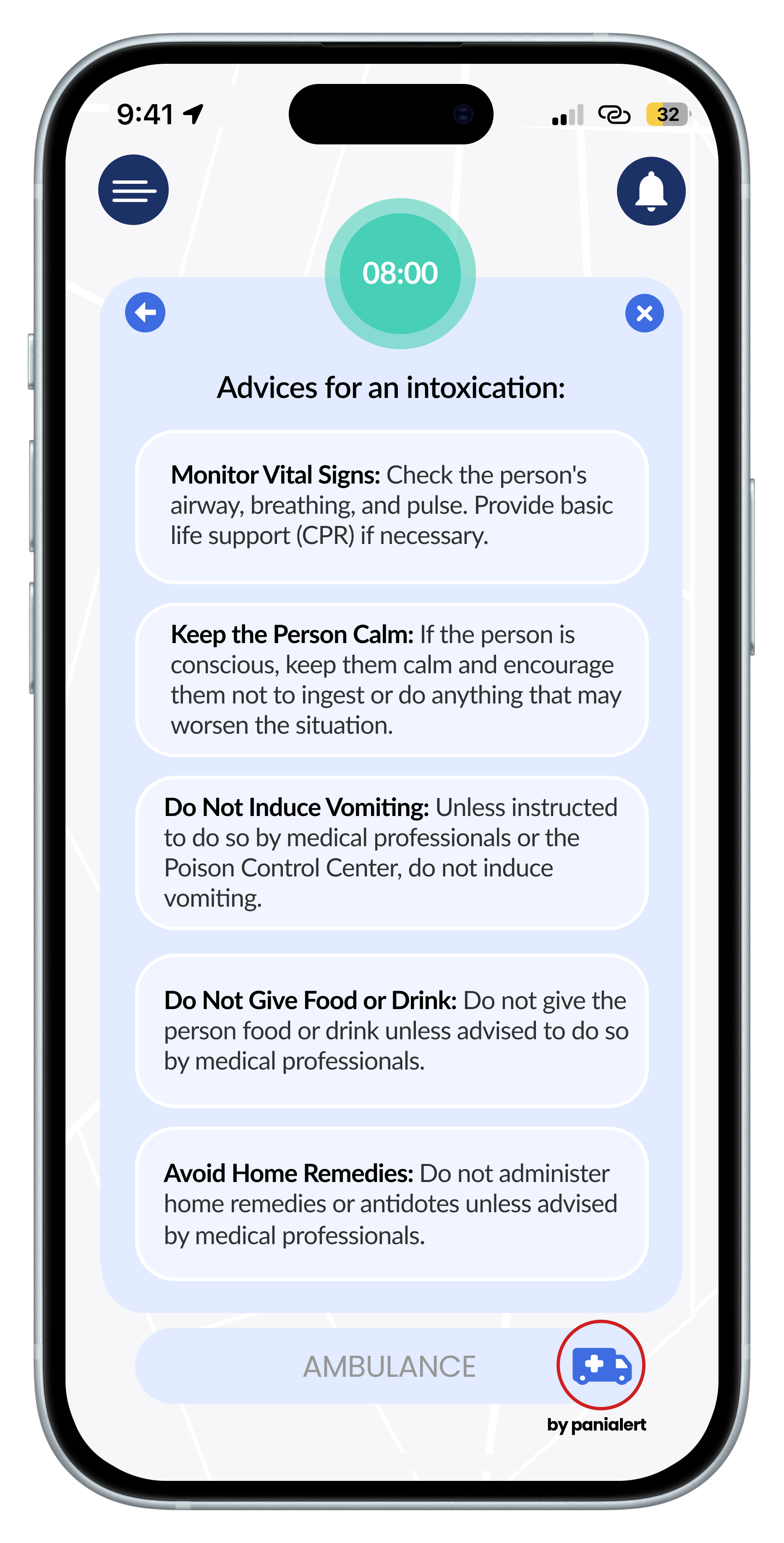
Panialert began with the idea of creating mobile application, integrated to Defensier, with the purpose of providing the user with a quick, safe, and reliable way to request immediate medical and security assistance. Users can reach out to the help service and share information about the incident, all while tracking the location and distance of the assistance on the map. Additionally, they receive recommendations and advice to follow while awaiting assistance.
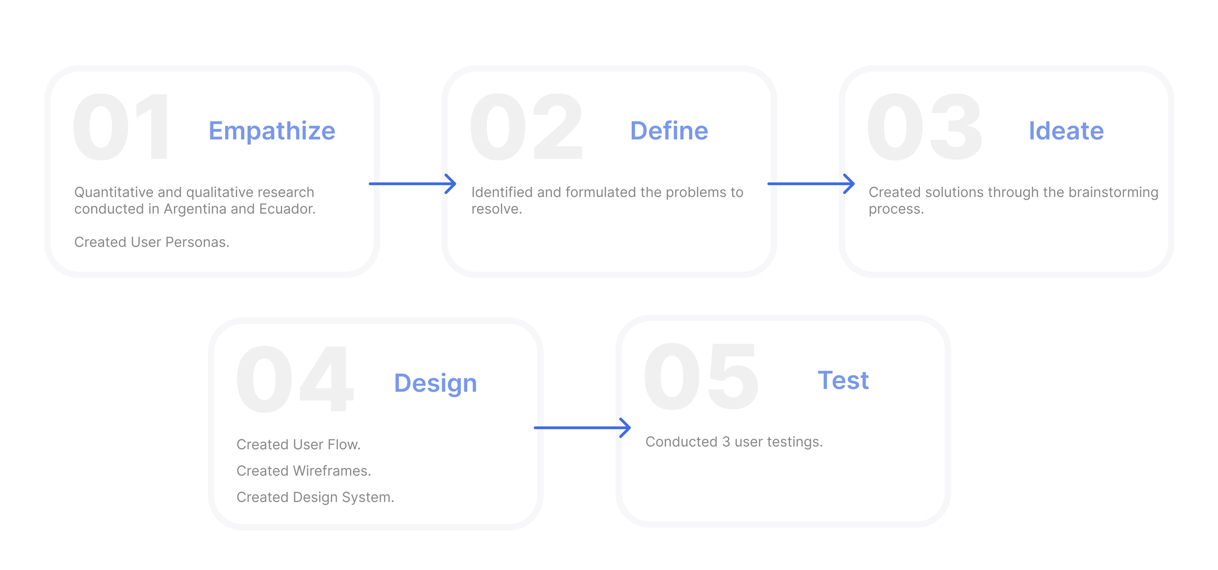
ABOUT THE PROCESS
USER PERSONAS
AMBULANCE SERVICE:

SECURITY SERVICE:

EMPATHY MAP

I created a map visualization of our user personas to gain a better understanding of their daily context.
02 DEFINE:
We processed the feedback and insights, which were based on real data gathered during the Empathize stage, to analyze and formulate our problem statements.
PROBLEM STATEMENTS
Guayaquil citizens need an accessible and quick way to request immediate medical and security assistance because their current system takes too long to respond.
Guayaquil citizens need a way to track the location of assistance while they wait because it helps to alleviate their fear during the waiting period for help.
Guayaquil citizens need a way to have their allergies or important medical conditions documented online in case of an emergency when they are alone.
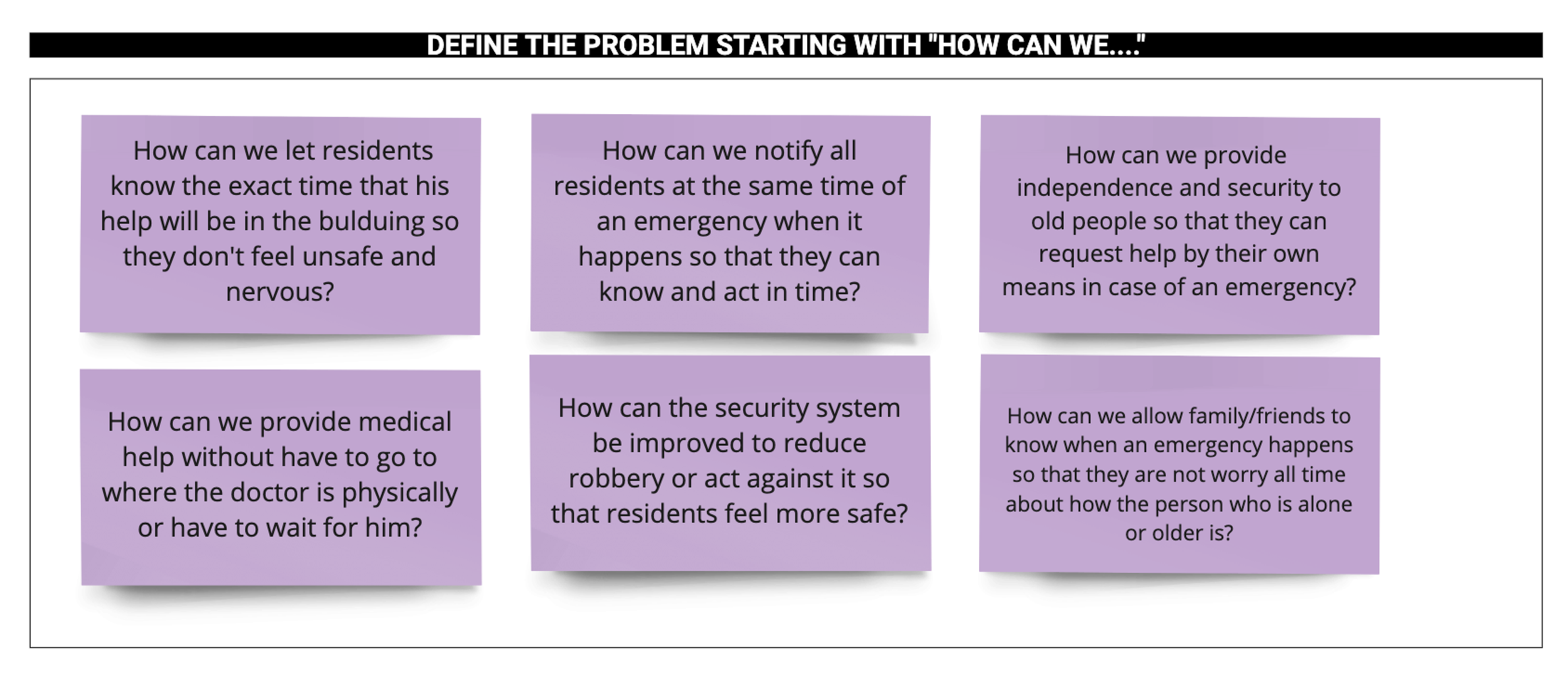
03 IDEATE:
We used the 'How can we…?' process to approach the problem statements from a different angle, allowing us to brainstorm various creative solutions.
04 DESIGN:
We created diagrams and wireframes to gain clarity on the sequence and content of screens that the user will navigate through before designing them.

USER FLOW
WIREFRAMES


DESIGN SYSTEM
I created a complete new Design System that uses uses neutral colors combined with more saturated colors, along with an extensive pattern library to ensure consistency, coherence, and efficiency across the design on all the screens.
PRIMARY COLORS


#3E6CE1
#F4F7FF
BACKGROUND AND TEXT COLORS


#E2EBFF
#000000
SECONDARY COLORS
#47CFB7
#DF827C
#D01F1F
EXPLANATION OF COLORS:
Light Blue: Security and serenity.
Red: Positive and energizing.
Salmon: Protection and union.
Black: Order and elegance.
Green: Feeling of calm.
White: Simplicity.
TYPOGRAPHY
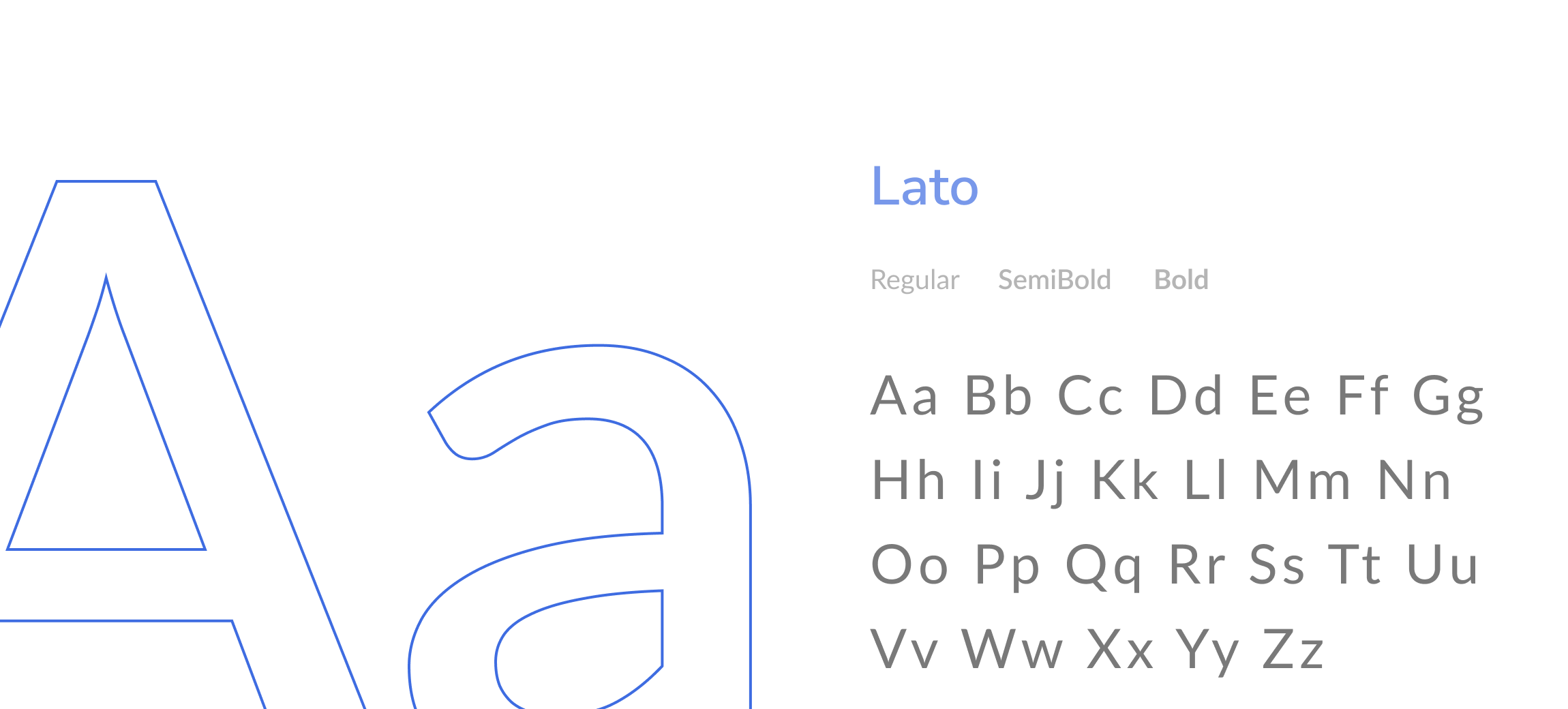
I selected the Lato typography for its versatile use with different weights and for the semi-rounded details of the letters, which impart a feeling of warmth. The strong structure provides stability and seriousness, and it is also easy to read on screens
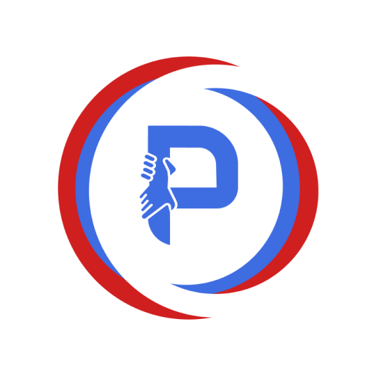
LOGO
The logo design features a circular shape with three lines, representing the different verticals within Diginnova: Defensier, Panialert, and Building Management. The design elements are consistently used across all logos for easy visual recognition of Diginnova's products. The circle and hand symbolize protection and care provided by the products.
Typography: Poppins Semibold.

Logo:
Isotype:

Favicon:
UI COMPONENTS:
Request help buttons


Disabled button

Enabled button

Timer


Secondary buttons


MOBILE SCREENS
MEDICAL EMERGENCY:


OUTCOME
I designed and prototype more than +20 mobile screens with their different functions in 2 weeks.